Your cart page is where customers review their entire purchase. It’s the online version of a shopping cart (hence the name) and where they confirm their purchase before moving on to payment. Having a well-designed cart page is important for making customers feel comfortable about purchasing and reducing cart abandonment.
What elements would you need?
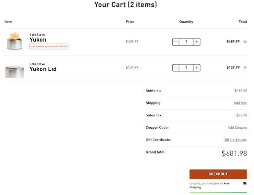
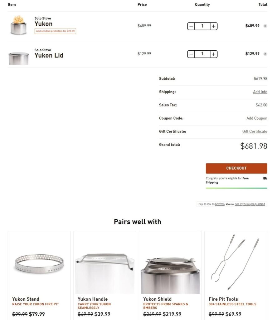
Detailed product summary.
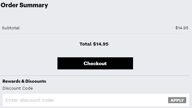
Promo code option.
Trust indicators.
Continue shopping button.
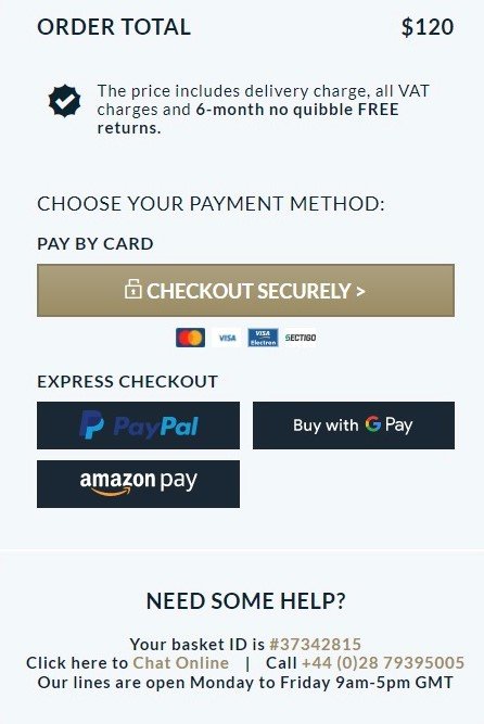
Prominent CTA button.
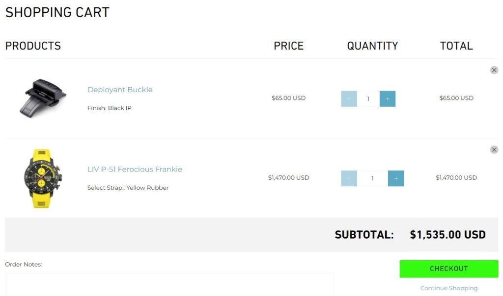
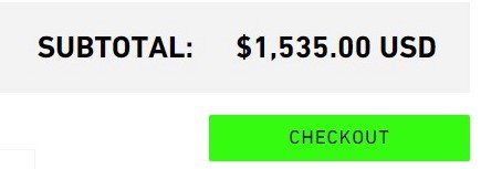
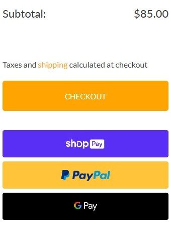
Subtotal and final cost.
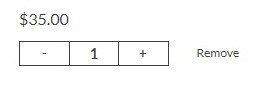
Cart editing tool.
Payment options.
Cross-sells/Upsells.
Detailed product summary
Provide the name of the product and a clear product image. Also, provide a brief description of the product along with info on the size and color selected which the shoppers can use to check if they have added the right product.
The product summary should include the following:
Image of each item (a thumbnail is sufficient)
Full title of each item, exactly as it appears on the product page
Variations of the item that the customer selected (such as the color or size)
Make it easy to find the contact information, shipping details, return policy and FAQ; if your customers realize they have questions they need answered before making a purchase.
Reassure your customers by including trust signals.
Sometimes your customers visit the cart page in the middle of their journey through your site. They aren’t done shopping, but they want to view what they already plan to buy. For these customers, it’s important to give them a clear route back to your collection and product pages.
The “continue shopping” button is technically a call-to-action, but the page’s primary CTA should be the “checkout” button. So make sure “continue shopping” is less conspicuous.
This is the most important button on the cart page, highlight it so it attracts customers attention.
It should stand out from all of the other elements on the page. Make this button large and colorful. Avoid using contextual words like “Next” or “Continue.” Instead, use meaningful words like “Pay Securely Now” or “Check Out.”
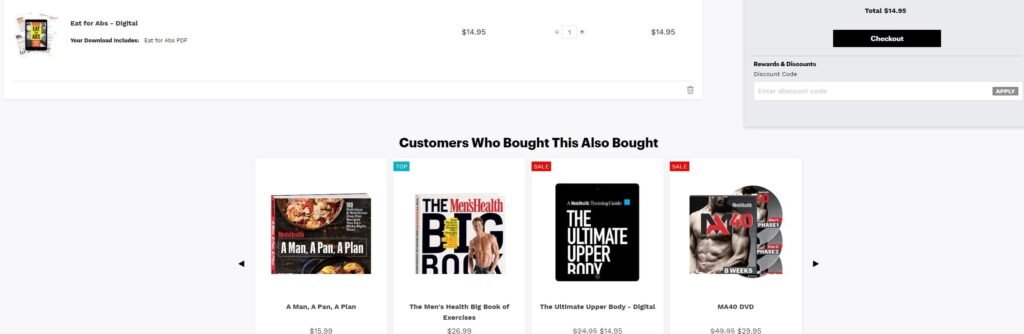
Offer some upsell and cross-sell options in order to increase your average order value.
If a customer reaches the cart page, you should see it as a strong signal that they are willing to buy. So this is the perfect opportunity to offer some upsell and cross-sell options.
Presenting cross-sells in the cart, or right after a product has been added to the cart, can enhance and streamline the user’s shopping experience.