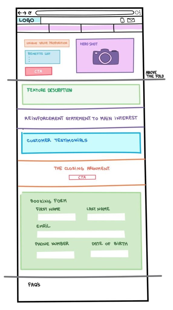
Your landing page should be serving one campaign goal. This is why they get better conversion rates than most homepages ever do. Every design element you include on your landing page should be in service of one singular campaign goal.
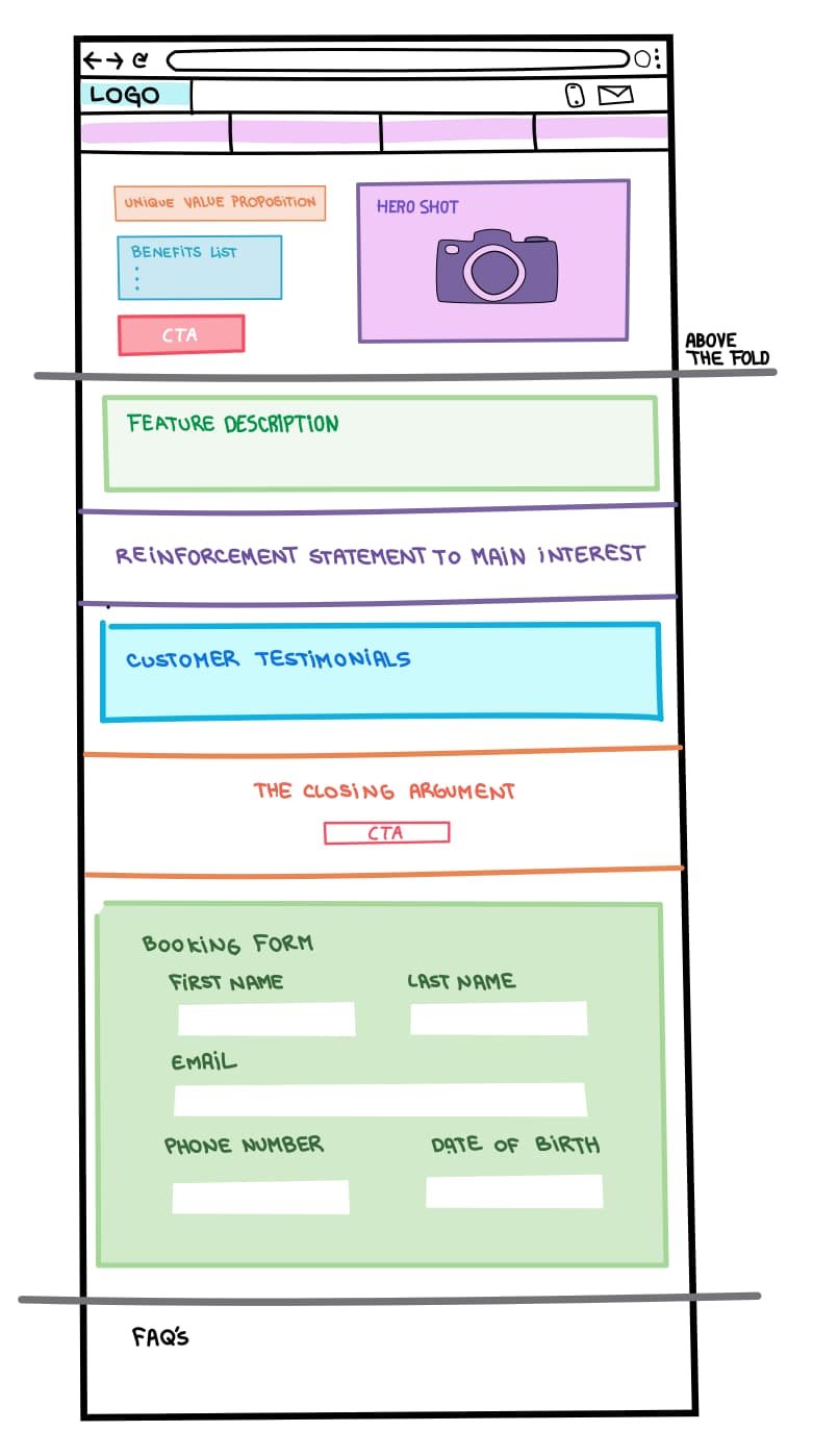
What elements would you need?
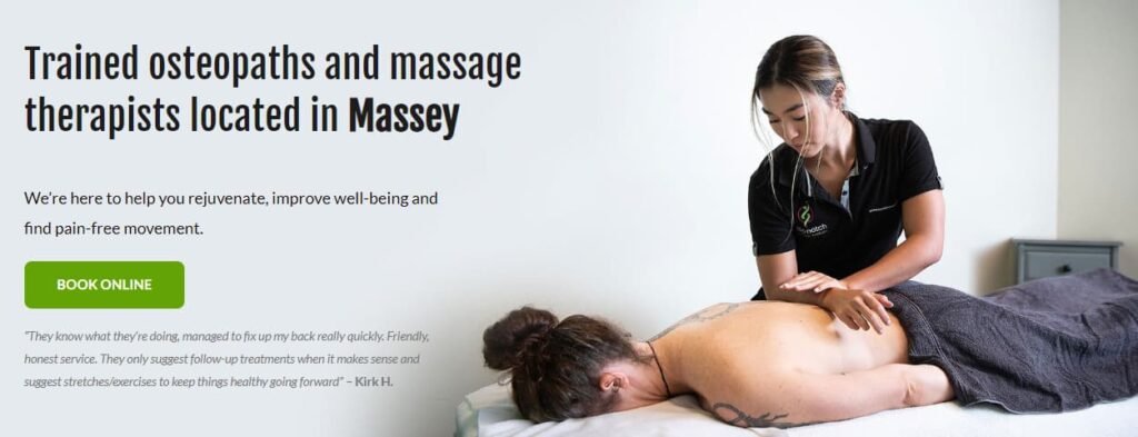
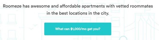
Value proposition.
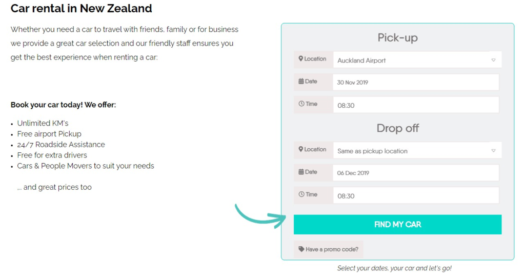
Select hero image.
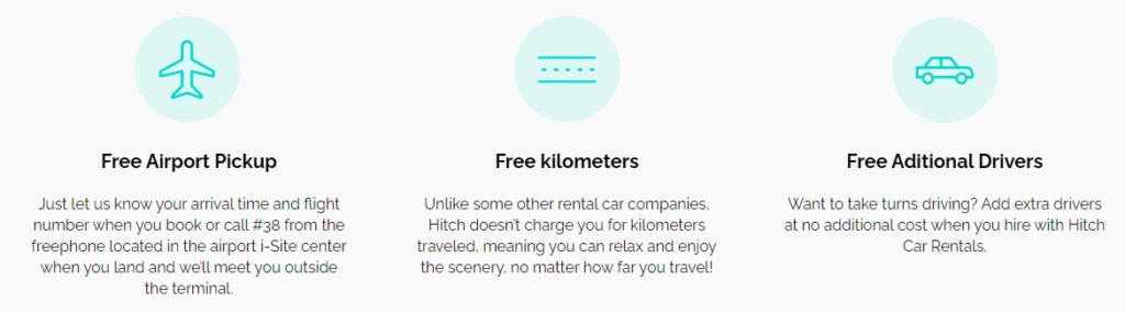
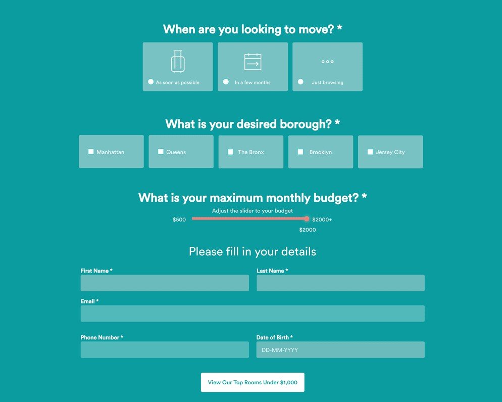
Benefits.
The call to action.
Visual form.
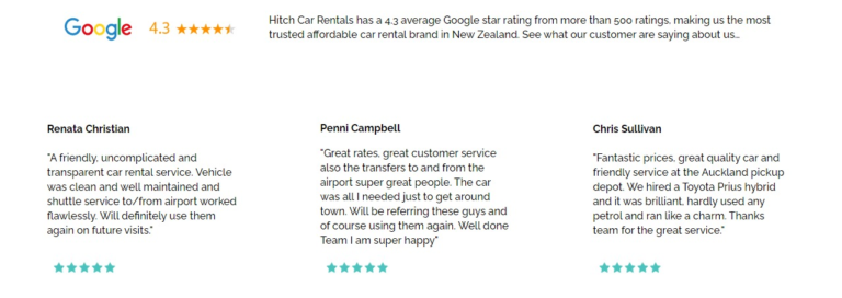
Social Proof.
Value proposition
Your unique value proposition is where you present your core description of what the page is about. If people can’t determine the purpose of your page from the main headline (and subhead) you’re doing something wrong.
Why is this a good value proposition example?
Is memorable:
It can be easily remembered and communicates a unique benefit (massages at home)
Is focused in theclient:
Shows a benefit that customers value
The hero shot is the best photograph or graphical image of your product or service, designed to make it stand out as something worth attaining. It should dominate the page, making it immediately clear what the page is about.
