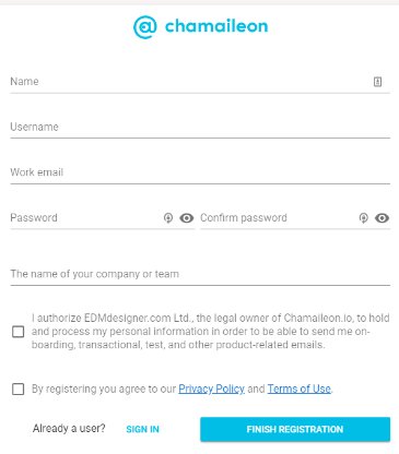
The form you build should be visually appealing, grabbing the visitor’s eyes and attention. Your form’s design also must combine the business patterns, following the color scheme, and never forgetting to add the logo to the form. Speak to the user’s needs. Ask a question, then change what comes next based on the answer. Easily segment and prioritize the top leads.
Issues to consider when you are creating a form
Single step or Multi-Step Form?
Prominent CTA.
Progress Bar.
Remove distraction.
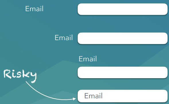
Label.
Single step or Multi-Step Form?
Use a single step form if:
You don’t have many fields (2-5).
You only need one type of information from the user.
You want the user to have complete transparency from the start on what you will be asking them.
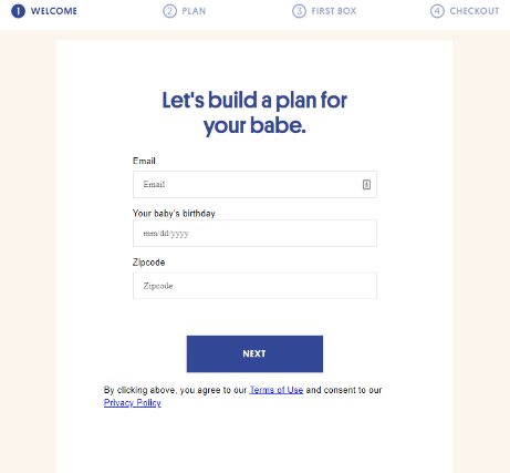
Use a multi-step form when:
The form is reasonably “long” (6+ fields)
The user expects to part with a reasonable amount of information and is motivated enough to complete multiple stages
You can easily group your questions into similar topic clusters
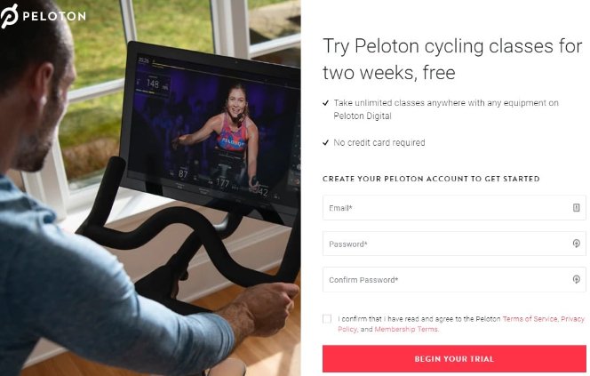
Your “call to action” button should stand out from your other content. It should be easy to recognize and understand, you want visitors to know what it represents.
CTA button is brightly colored and has a customized submit button with actionable copy.
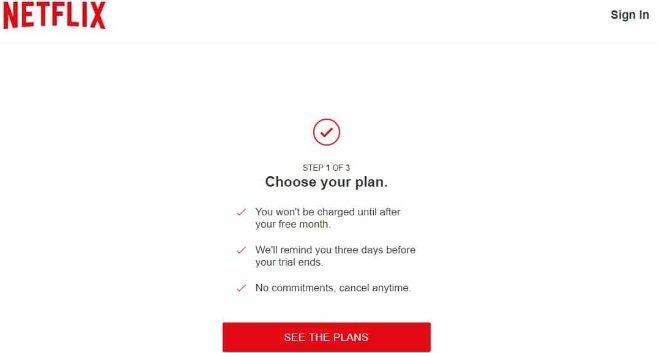
Don´t ask for information unless you truly need it. If you must ask, make sure you tell them the reason why. Remove distraction. A form only function is to be completed, don’t give people an easy way out.
Netflix’s lead generation form is straightforward, clean, and distraction-free for maximum conversions.
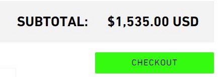
This is the most important button on the cart page, highlight it so it attracts customers attention.
It should stand out from all of the other elements on the page. Make this button large and colorful. Avoid using contextual words like “Next” or “Continue.” Instead, use meaningful words like “Pay Securely Now” or “Check Out.”