Depends on your target audience, and what format you think would be most intuitive and accessible to them. There’s no one “right” way to design it. You simply have to consider how you can enable first-time and repeat visitors to get the most out of your site.
Menu types
Horizontal navigation bar.
Dropdown navigation menu.
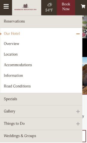
Hamburger navigation menu.
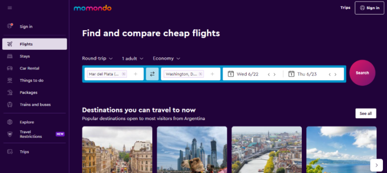
Vertical sidebar navigation menu.
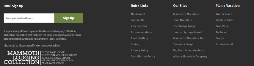
Footer menu.
Horizontal Navigation Bar
The horizontal navigation bar is the most common type of navigation menu. It lists the major pages side-by-side and is placed in the website header.
The sections featured can include content categories as well as links to a learn more page and a sign-in page.
Most often seen in mobile web design. With this approach, the navigation items are often listed horizontally on larger screen sizes and collapse behind a hamburger button on smaller screen sizes.
This type of design is ideal for mobile apps or sites where real estate is limited.